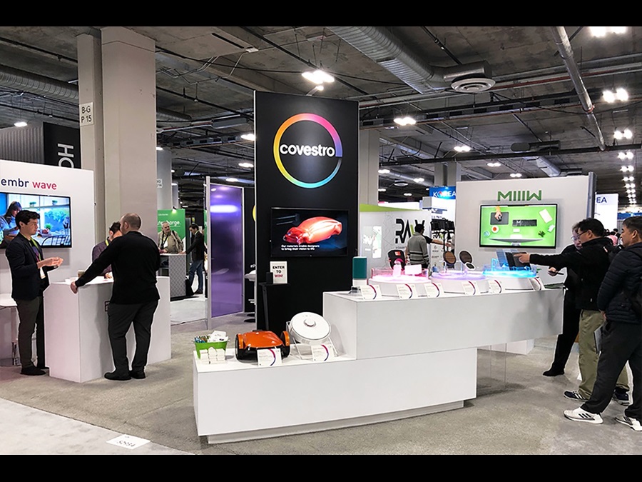
Highlight
Examples
This component is a slider for images and videos. You can also add an information block to the slider and add a CTA button.
Underneath slider adds an extra function with every image. You can make a mix of different images and videos with the different configuration. If you want to add the information block, make the sure the most important part of image/video will not be covered.
Briefing
Important notes
-
Number of characters
- Component title: 60 characters
- Caption text: 100 characters
- Alt text: 100 characters
- Slide title: 60 characters
- Slide description: 300 characters
- Button label: 30 characters
- Ideal image size: 1440 x 960 px
- For video always provide a Moving Images ID
- For Images always provide a Mediahub ID
- Link
- Media assets
- Link within the solution center
- Link out of the solution center (possible in a new tab)
- Gate: possible to make the link gated
- Color:
- Default same color as the theme of the page.
- Can be changed to one of the standard colors: blue, green, magenta, orange, purple
- Max items: no limit, when there are more than 10 images, it will just show numbers instead of dots as indicator
- Always indicate the placement of the highlight component on the page

